

Subscribe to AccessBit Newsletter
Accessibility

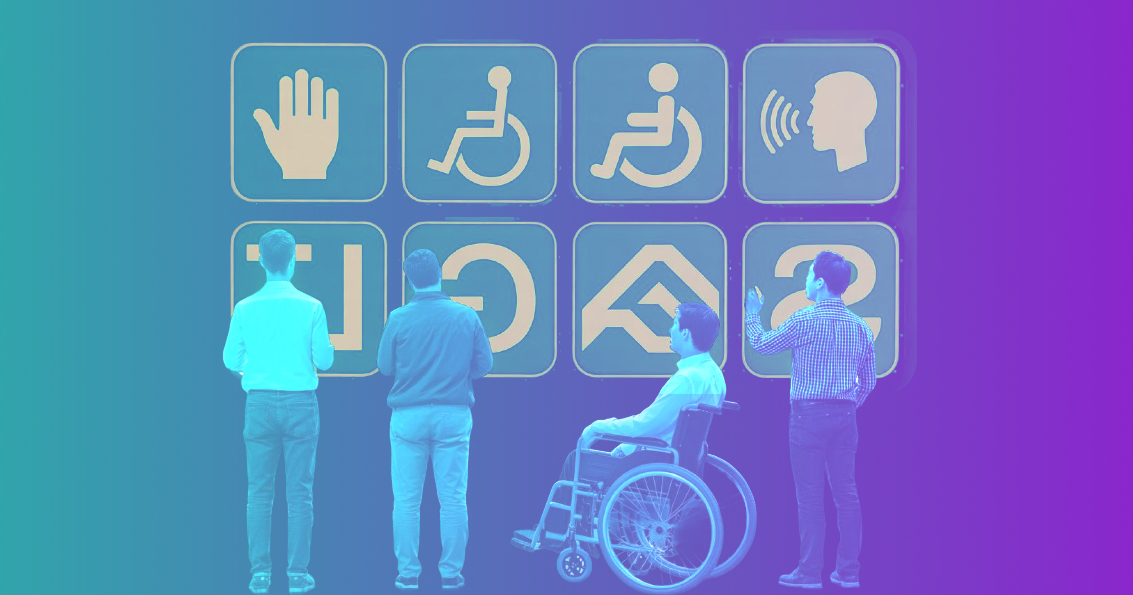
If you're building or maintaining a website in 2026 and accessibility still feels like a "nice to have," it's time for a reset. Roughly 16% of the world's population lives with some form of disability, U.S. ADA-related digital lawsuits crossed 4,000 filings a year before plateauing, and the European Accessibility Act became enforceable in June 2025, meaning any business selling digital products into the EU now has a legal obligation to meet defined accessibility standards.
Beyond compliance, accessible websites are simply better websites. They load faster, rank higher in search, work on more devices, and convert more visitors. The same code changes that help a screen reader user also help someone on a slow rural connection, a parent navigating one-handed with a baby, and a 60-year-old executive who forgot their reading glasses.
This guide is a complete checklist of the website accessibility features every modern site should ship with, what they are, why they matter, and how to implement them. No fluff, no overlay-widget snake oil, just the real list.
What "Web Accessibility" Actually Means
Web accessibility means designing and building digital experiences that people with disabilities, visual, auditory, motor, cognitive, and neurological, can perceive, understand, navigate, and interact with on equal footing.
The global standard is the Web Content Accessibility Guidelines (WCAG), currently at version 2.2, with WCAG 3.0 in working draft. Most laws (ADA in the U.S., EAA in Europe, AODA in Ontario, the Equality Act in the UK) point to WCAG 2.1 or 2.2 Level AA as the practical bar.
WCAG is built on four principles, often abbreviated POUR:
- Perceivable, users can sense the content (vision, hearing, touch)
- Operable, users can navigate and interact with it
- Understandable, content and behavior are predictable and clear
- Robust, it works across browsers, devices, and assistive technologies
Every feature below maps to one or more of these.
The Website Accessibility Checklist
1. Semantic HTML and Proper Document Structure
The single highest-leverage accessibility feature isn't a feature at all, it's writing HTML that actually means what it says.
Use <header>, <nav>, <main>, <article>, <section>, <aside>, and <footer> instead of a sea of <div>s. Use one <h1> per page and follow a logical heading order (h1 → h2 → h3, no skipping levels for visual styling). Use <button> for actions and <a> for navigation, never the other way around.
Why it matters: screen readers build a navigable outline of your page from these elements. Get the structure right and 40% of accessibility work is done.
<!-- Bad -->
<div class="header"><div class="big-text">Welcome</div></div>
<div class="clickable" onclick="submit()">Buy now</div>
<!-- Good -->
<header><h1>Welcome</h1></header>
<button type="submit">Buy now</button>
2. Full Keyboard Navigation
Every interactive element on your site must be reachable and operable using only a keyboard, no mouse, no trackpad, no touch. This is non-negotiable for users with motor disabilities, anyone using a screen reader, and power users who simply prefer keyboards.
Tab through your entire site right now. Can you reach every link, button, form field, dropdown, modal, and menu? Can you escape modals with Esc? Can you operate dropdowns with arrow keys? If anything traps focus or skips an element, fix it before shipping.
Avoid tabindex values greater than 0, they break the natural tab order and create more problems than they solve.
3. Visible Focus Indicators
When a keyboard user tabs to an element, there must be a clear visual indicator showing where focus is. Removing the default outline (outline: none) without replacing it is one of the most common, and most harmful, accessibility mistakes on the web.
/* Don't do this without a replacement */
*:focus { outline: none; }
/* Do this instead */
*:focus-visible {
outline: 3px solid #0066cc;
outline-offset: 2px;
border-radius: 4px;
}
The :focus-visible pseudo-class is the modern best practice, it shows the indicator for keyboard users but not for mouse clicks, giving you the cleanest of both worlds.
4. Descriptive Alt Text for Images
Every meaningful image needs an alt attribute that describes its content or function. Decorative images get alt="" (empty, but present) so screen readers skip them.
Rules of thumb:
- Describe the purpose, not the pixels. For a "Sign up" button graphic, alt text is "Sign up," not "Blue button with white text."
- Don't start with "Image of…", screen readers already announce that.
- For complex charts and infographics, provide a longer description nearby or in aria-describedby.
- Logos in the header: alt text is the company name.
<img src="ceo.jpg" alt="Priya Menon, CEO">
<img src="decorative-swirl.svg" alt="">
<img src="quarterly-revenue.png"
alt="Q4 2025 revenue chart showing 23% YoY growth"
aria-describedby="chart-detail">
<p id="chart-detail">Revenue grew from $4.1M to $5.0M…</p>
5. Sufficient Color Contrast
Text must have a contrast ratio of at least 4.5:1 against its background for normal text and 3:1 for large text (18pt+ or 14pt+ bold) under WCAG AA. AAA tightens this to 7:1 and 4.5:1.
This single fix typically resolves 30–50% of automated accessibility errors on a typical site. Light gray placeholder text on white is the most common offender.
Tools like the WebAIM Contrast Checker, Stark, or your browser DevTools' built-in contrast inspector make this trivial to verify. Test in both light and dark modes.
6. Don't Rely on Color Alone
If your form shows errors only by turning fields red, colorblind users will miss them entirely. Always pair color with another visual cue, an icon, text label, underline, or pattern.
<!-- Inaccessible: red border only -->
<input type="email" class="error">
<!-- Accessible: icon + text + color -->
<input type="email" aria-invalid="true" aria-describedby="email-error">
<div id="email-error" role="alert">
<svg aria-hidden="true">…</svg>
Please enter a valid email address.
</div>
7. Accessible Forms with Proper Labels
Every form input needs a programmatically associated <label>. Placeholder text is not a label, it disappears when the user types and is often too low-contrast to read.
<!-- Required pattern -->
<label for="email">Email address</label>
<input type="email" id="email" name="email" autocomplete="email" required>
Group related fields with <fieldset> and <legend>. Use the right type (email, tel, url, date) so mobile keyboards adapt. Use autocomplete attributes, they help users with cognitive and motor disabilities, and they boost conversion for everyone.
For errors, use aria-invalid="true" on the offending field, link to the message with aria-describedby, and announce it via role="alert" or a live region.
8. Skip Navigation Links
A "Skip to main content" link as the very first focusable element on the page lets keyboard and screen reader users bypass repetitive navigation. It can be visually hidden until focused.
<a href="#main" class="skip-link">Skip to main content</a>
<!-- nav, header, etc. -->
<main id="main" tabindex="-1">…</main>
.skip-link {
position: absolute;
left: -9999px;
}
.skip-link:focus {
left: 1rem;
top: 1rem;
background: #000;
color: #fff;
padding: 0.75rem 1rem;
z-index: 100;
}
9. ARIA, But Only When You Need It
The first rule of ARIA is: don't use ARIA. Native HTML almost always handles things correctly on its own. ARIA is for the gaps, custom components like tabs, accordions, comboboxes, and modals where no native element exists.
Common patterns worth knowing:
- aria-label, invisible accessible name (icon-only buttons)
- aria-labelledby, points to another element as the name
- aria-describedby, points to additional description
- aria-expanded, for toggles and disclosures
- aria-current="page", for the current item in a navigation list
- role="alert" and aria-live, for dynamic announcements
A wrong ARIA attribute is worse than none. If you wouldn't normally announce "button collapsed" to a sighted user, don't announce it to a screen reader user either.
10. Captions, Transcripts, and Audio Descriptions
Video content needs synchronized captions for users who are deaf or hard of hearing. Audio-only content (podcasts, audio messages) needs a transcript. Videos with important visual information that isn't otherwise narrated need audio descriptions.
Auto-generated captions from YouTube or Otter are a starting point, never the final product, review and correct them before publishing. Position captions where they don't obscure on-screen text or speakers' faces.
11. Respect User Preferences for Motion
Vestibular disorders, migraines, and ADHD can all be triggered by aggressive animation. Modern browsers expose a system-level preference users can set, and your CSS should honor it:
@media (prefers-reduced-motion: reduce) {
*, *::before, *::after {
animation-duration: 0.01ms !important;
animation-iteration-count: 1 !important;
transition-duration: 0.01ms !important;
scroll-behavior: auto !important;
}
}
Avoid auto-playing carousels, parallax scrolling, and content that flashes more than three times per second (which can trigger seizures).
12. Resizable Text Without Breaking the Layout
Users must be able to zoom to 200% without losing content or functionality, and text must remain readable when font size is increased. Use relative units (rem, em, %) for font sizes and container widths instead of fixed pixels. Test by zooming your browser to 200% and 400%, does anything overlap, get cut off, or require horizontal scrolling?
13. A Declared Page Language
A single line, but easy to forget:
<html lang="en">
This tells screen readers which pronunciation rules to use. For pages or sections in another language, use lang on the relevant element (<span lang="fr">bonjour</span>).
14. Predictable Navigation and Consistent Layout
Place primary navigation in the same location across pages. Use consistent labels for the same actions (don't say "Buy now" on one page and "Add to cart" on another for the same flow). Don't change context unexpectedly when a user focuses an input or selects from a dropdown, these are explicit WCAG violations and major usability problems.
15. Accessible Modals, Dropdowns, and Custom Components
If you're building a modal dialog, it must:
- Trap focus inside while open
- Be dismissible with Esc
- Return focus to the trigger element when closed
- Use role="dialog" and aria-modal="true" (or, better, the native <dialog> element with showModal())
- Have a labeled close button
If you're building a custom dropdown, accordion, tab, or combobox, the ARIA Authoring Practices Guide (APG) has reference patterns for each. Follow them; don't invent your own.
16. Mobile and Touch Accessibility
Tap targets should be at least 44 × 44 CSS pixels (Apple HIG) or 48 × 48 (Material Design), with adequate spacing between them. Don't rely on hover, it doesn't exist on touch devices. Make sure your site works in both portrait and landscape, and that pinch-to-zoom is not disabled (user-scalable=no in your viewport meta tag is an accessibility failure).
17. Plain Language and Cognitive Accessibility
Often overlooked, often the highest-impact change:
- Write at roughly an 8th-grade reading level for general audiences
- Break long paragraphs into shorter ones
- Use clear headings and bullet points where they actually help
- Define jargon and acronyms on first use
- Be explicit about what will happen ("Submit" vs. "Submit application, you can't edit after this")
18. Accessible Error Recovery
For any form that handles money, legal commitments, or personal data, give users a way to review and correct their input before final submission. Confirm dialogs are fine; surprise irreversible actions are not.
Testing: How to Actually Verify Accessibility
Automated tools catch roughly 30–40% of accessibility issues. The rest require human testing. A solid workflow:
Automated scans (catch the easy stuff):
- axe DevTools, browser extension, the industry default
- WAVE by WebAIM, visual overlay highlighting issues
- Lighthouse, built into Chrome DevTools, includes accessibility scoring
- Pa11y, for CI/CD pipelines
Manual checks (catch the rest):
- Tab through every page from top to bottom
- Test with a real screen reader: NVDA (free, Windows), VoiceOver (built into macOS and iOS), or TalkBack (Android)
- Zoom to 200% and 400%
- Disable CSS, does the content still make sense in order?
- Check color contrast for every text/background combination
User testing: Nothing replaces feedback from people who actually use assistive technology daily. Services like Fable and AccessWorks connect you with disabled testers; many disability advocacy organizations also offer paid usability research.
What to Avoid: Accessibility Overlay Widgets
You've seen them, the little blue accessibility icon in a corner that pops up a menu of "high contrast" and "bigger text" toggles. Skip them.
These tools claim to make your site WCAG-compliant with one line of JavaScript. They don't. The U.S. Department of Justice has explicitly stated that overlays do not bring sites into ADA compliance, lawsuits against sites using overlays have continued to succeed, and the disability community has been vocal that overlays often make assistive technology worse, not better, by interfering with native screen readers.
Real accessibility comes from your underlying code and content. There are no shortcuts.
Conclusion
The website accessibility features in this checklist aren't a wishlist for some hypothetical future redesign, they're the baseline for any modern site that takes its users, its legal exposure, and its craft seriously. Most of them are simple. Most of them improve the experience for everyone, not just users with disabilities. And most of them cost nothing beyond the discipline to build things correctly the first time.
Start with semantic HTML, contrast, keyboard navigation, and form labels. Run an automated scan. Test with a screen reader for ten minutes. You'll be ahead of most of the web before lunch.
Accessibility is a quality of how you build, end to end.
Found this useful? Share it with the developer, designer, or product manager who needs to see it most.
Frequently Asked Questions
What is the difference between WCAG 2.1 and 2.2?
WCAG 2.2 (published October 2023) added nine new success criteria focused on cognitive accessibility, mobile, and users with low vision, including focus appearance requirements, drag-and-drop alternatives, and consistent help. It's backward-compatible with 2.1.
Is web accessibility legally required?
In most major markets, yes. The ADA (U.S.), EAA (EU, enforceable June 2025), AODA (Ontario), Equality Act (UK), and similar laws in Australia, Israel, and elsewhere all require digital accessibility for businesses meeting certain thresholds. Public-sector sites face stricter rules almost everywhere.
How long does it take to make a site accessible?
For a new site built with accessibility from day one, the marginal cost is essentially zero, it's just doing things correctly. Retrofitting an existing site typically takes weeks to months depending on size and complexity. Audit first, then prioritize fixes by impact.
Will accessibility hurt my design?
No. Accessibility constrains some design choices (contrast, motion, focus indicators) but those constraints almost always produce better, clearer, more usable interfaces. Some of the most beautifully designed sites on the web are also among the most accessible.
Does accessibility help SEO?
Significantly. Semantic HTML, alt text, descriptive link text, video transcripts, page structure, and mobile usability are all signals Google uses for ranking and requirements for accessibility. The overlap is roughly 70%.


