

Subscribe to AccessBit Newsletter
Accessibility


If you fixed only one accessibility issue on your website, color contrast would be the one to start with. It is the most common failure by a wide margin, and it is also one of the easiest to fix.
The WebAIM Million 2026 report, which analyzes the top one million home pages, found low contrast text on 83.9% of them. That made it the number one detected WCAG failure, ahead of empty links, missing alt text, and unlabeled buttons. In other words, most websites are hard to read for a meaningful portion of their visitors, often without anyone realizing it.
Here is what color contrast is, what WCAG actually requires, and how to check and fix it.
What color contrast is, and why it matters
Color contrast is the difference in brightness between text and the background behind it. Light gray text on a white background has low contrast. Black text on white has high contrast.
This is not only about people who are blind or have low vision, though it matters a great deal to them. Low contrast also affects:
- Anyone using a screen in bright sunlight
- Older users, as contrast sensitivity declines with age
- People with color vision deficiencies
- Frankly, everyone, because harder-to-read text quietly increases bounce and lowers conversion
Good contrast is one of the rare accessibility wins that improves the experience for every single visitor, not just some of them.
What WCAG actually requires
WCAG sets specific, testable contrast ratios. A ratio compares the brightness of two colors, from 1:1 (identical) to 21:1 (black on white).
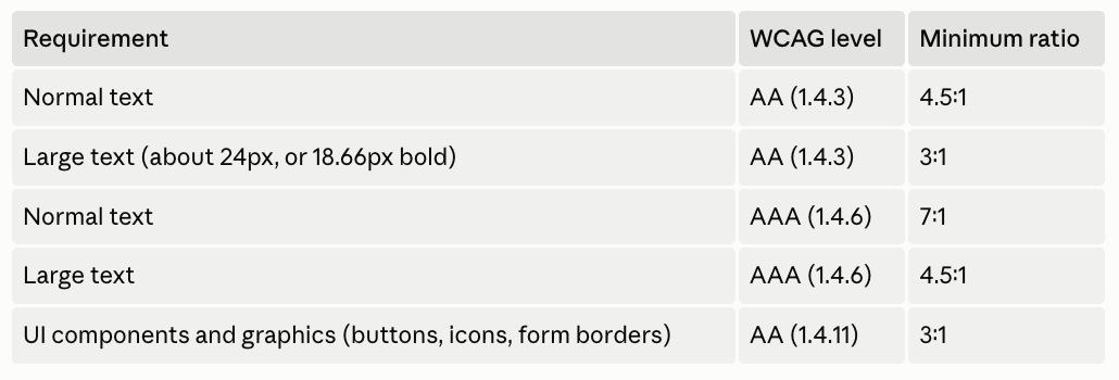
For most websites, Level AA is the target, so the two numbers to remember are 4.5:1 for normal text and 3:1 for large text. Do not forget the last row: buttons, icons, and form field borders also need enough contrast to be seen, not just the words.
How to check your contrast
You do not have to guess. Any of these will give you an exact ratio:
- A free online contrast checker (such as WebAIM's): paste in your text and background colors and it tells you whether they pass AA and AAA.
- Browser developer tools: Chrome and Firefox show a contrast ratio when you inspect a text element, and Chrome can even highlight failing text on the page.
- Design tool plugins: contrast checkers exist for Figma and other design tools, so you can catch problems before they are ever built.
Check your real content, not just your brand palette in isolation. The same blue that passes as a heading can fail as small body text.
How to fix it
Once you find a failing color pair, the fixes are usually simple:
- Darken the text or lighten the background until the ratio passes. Small shifts often do the job.
- Increase the font size or weight where it makes sense, since large text has a lower threshold (3:1).
- Never rely on color alone to convey meaning. Links, errors, and required fields need another signal (an underline, an icon, text) as well as a color.
- Check every state, not just the default. Placeholder text, disabled buttons, hover states, and visited links are common hidden failures.
- Watch text over images and gradients. Add a solid overlay or a text background so the contrast holds no matter what is behind it.
The mistakes we see most often
Certain patterns cause the majority of contrast failures:
- Light gray body text on white, the single most common offender
- Placeholder text used as if it were a label (it is almost always too light)
- Brand-colored buttons where the text does not contrast with the button
- White text on a busy background image
- Thin, low-contrast form field borders that are hard to see
Most of these come from prioritizing a certain look over readability. The good news is that fixing them rarely means abandoning your brand, just adjusting shades until they pass.
Where a personalization layer fits
Some users need more contrast than even a well-designed site provides by default. A personalization layer like AccessBit lets visitors switch to a high-contrast mode, adjust colors, or increase text size to suit their own needs.
That said, personalization is an addition, not a substitute. The underlying contrast still needs to meet WCAG in your design, because that is what serves the majority of users who will never open an adjustment menu. Fix the contrast in the design first, then give users control on top of it.
Frequently asked questions
1. What is the minimum color contrast for accessibility?
Under WCAG Level AA, normal text needs a contrast ratio of at least 4.5:1 against its background, and large text (about 24px, or 18.66px bold) needs at least 3:1. User interface elements like buttons and form borders need at least 3:1.
2. Why is color contrast the most common accessibility issue?
Because design often prioritizes a particular aesthetic, such as light gray text, over readability. The WebAIM Million 2026 report found low contrast text on 83.9% of home pages, making it the most common WCAG failure.
3. How do I check my website's color contrast?
Use a free contrast checker (like WebAIM's), your browser's developer tools, or a Figma plugin. Enter your text and background colors and it will tell you whether they meet WCAG AA and AAA.
4. Does an accessibility overlay fix color contrast?
An overlay or personalization layer can offer users a high-contrast mode, but it does not fix the underlying colors in your design. Those still need to meet WCAG so the site works for the majority of visitors who will not adjust settings.
5. Is large text allowed to have lower contrast?
Yes. Because larger text is easier to read, WCAG AA allows a 3:1 ratio for large text (about 24px, or 18.66px bold), versus 4.5:1 for normal text.
Want to know how your site's contrast holds up?
Contrast is the fastest accessibility win, and it is only the start. AccessBit is the personalization layer that lets your visitors adjust contrast, color, and text to their own needs, on top of a site that meets the baseline in its design.
.png)


